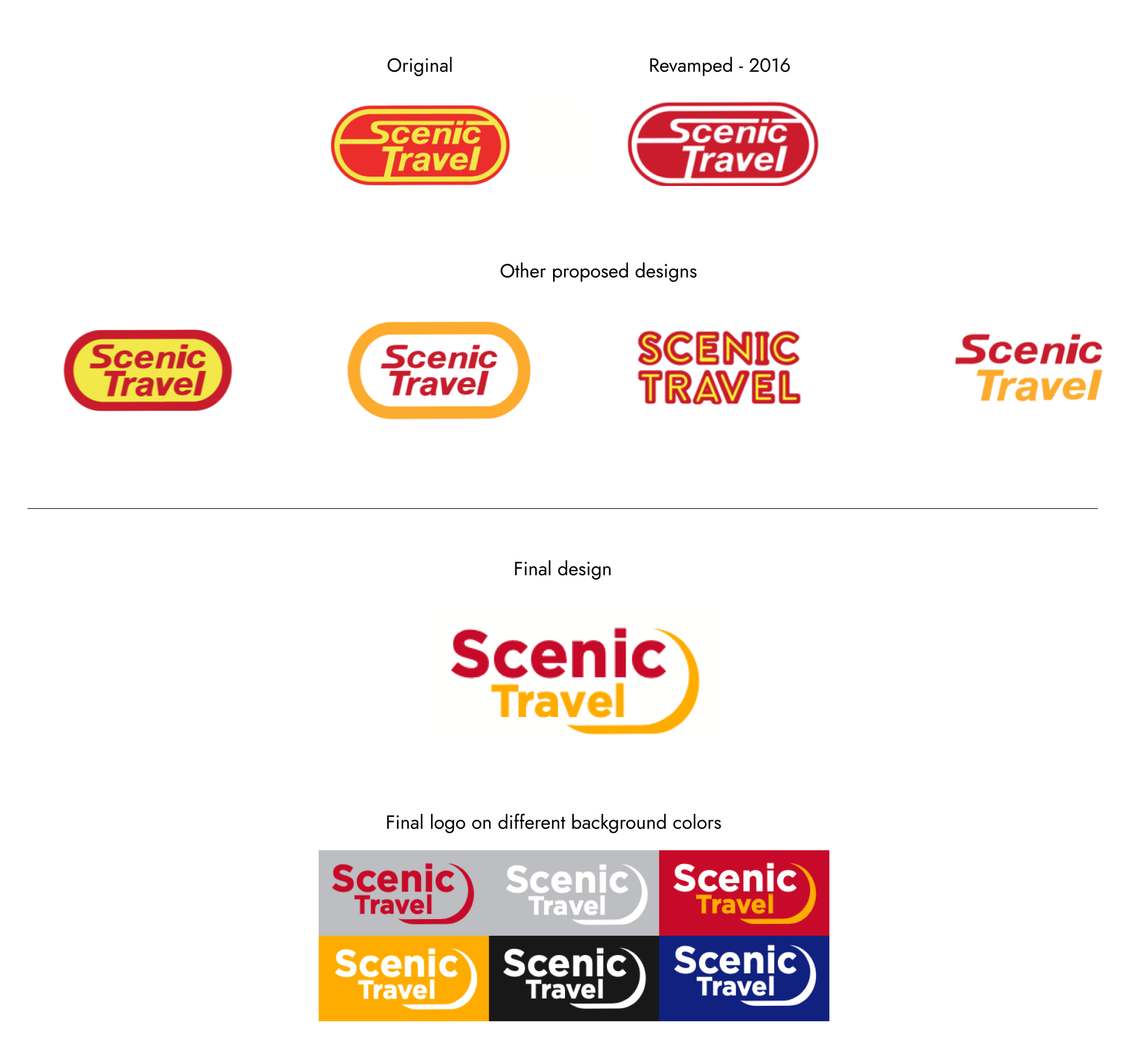
I worked with the marketing team to re-design existing logo identity.
The Designs
Different variations of designs were proposed from tweaking the oval shape to text logos. A revised logo was made in 2016 to perceive a modern look by eliminating the secondary yellow color. In 2019, a revision was made to bring it back where it focused on the text logo while still adding the slight curve from the traditional oval shape.
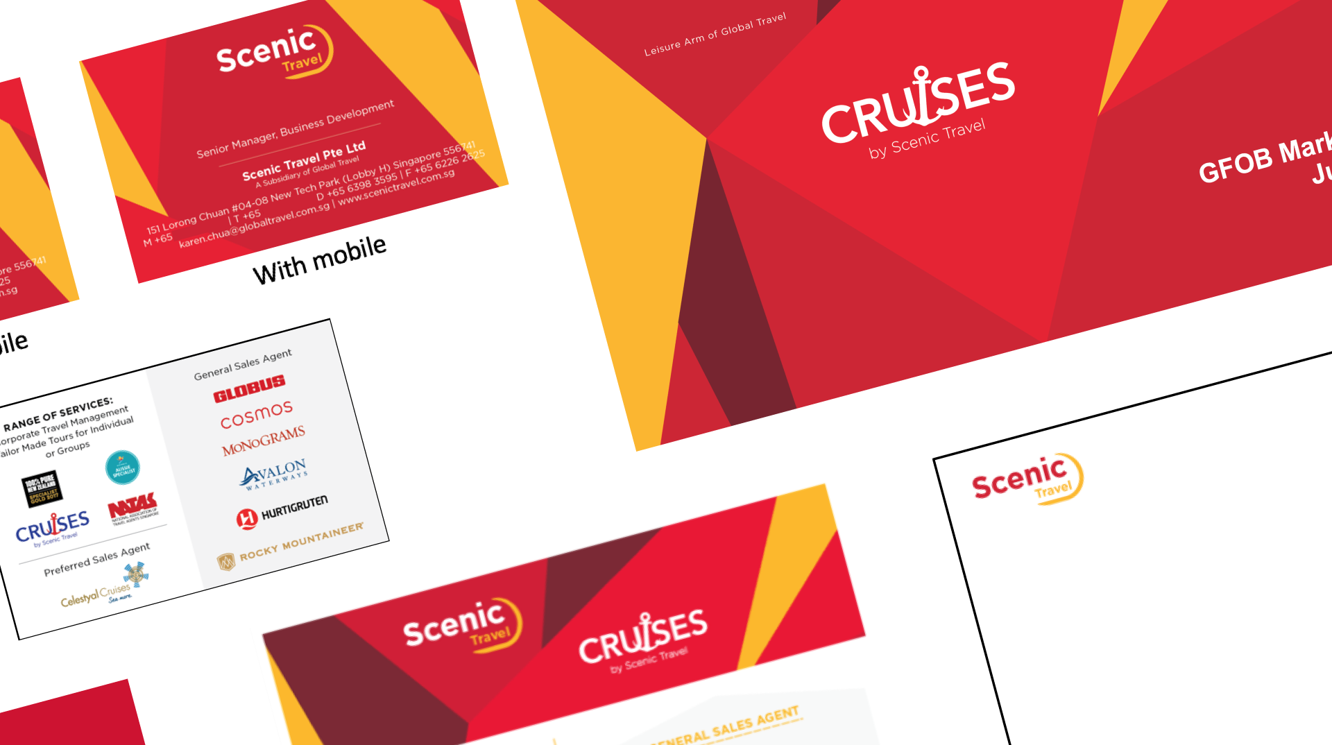
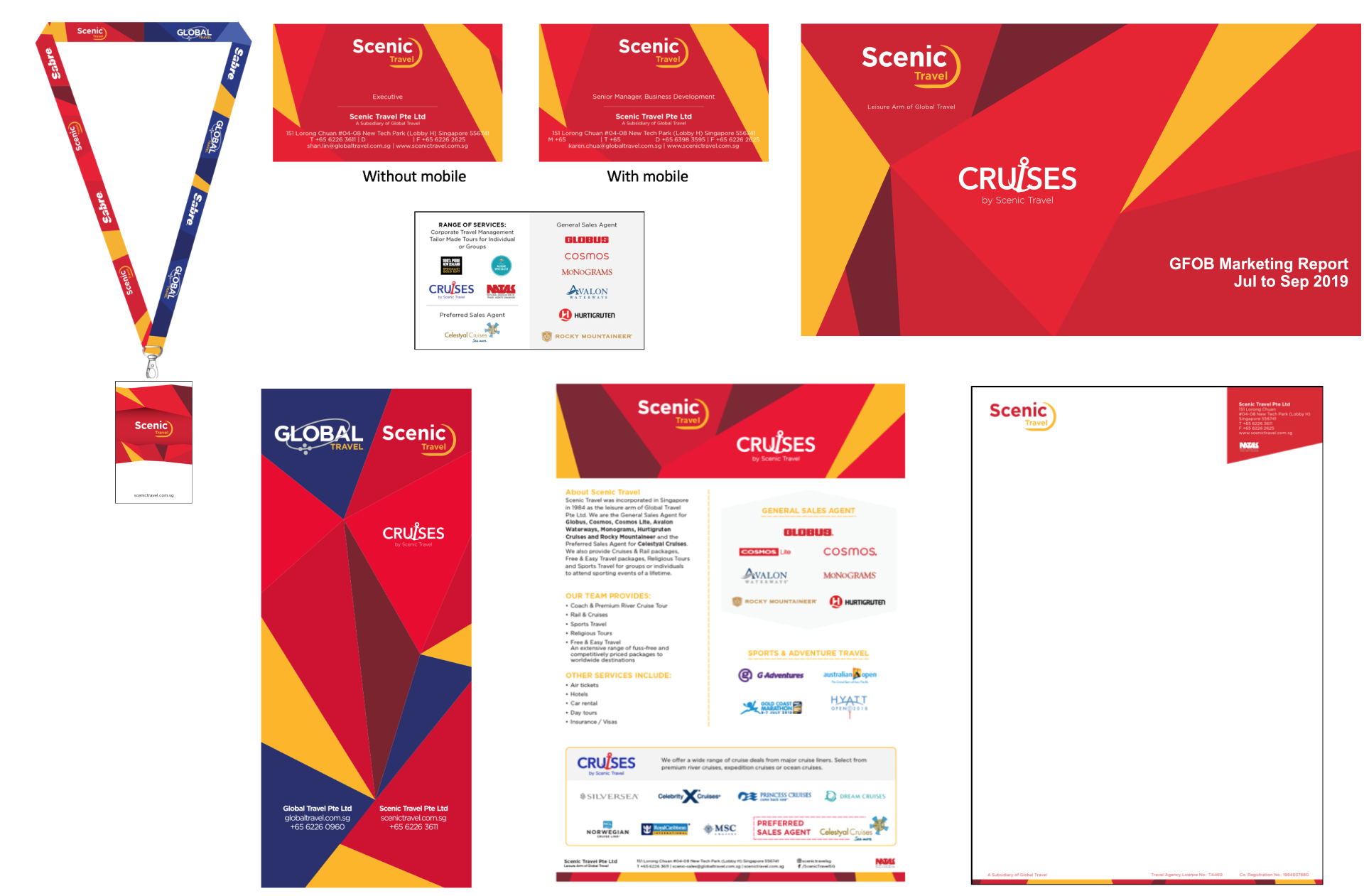
Rebranded collaterals from lanyard, namecards, brochures and standee banner.